Hello and welcome!!
As sad as I was to say farewell to my previous site just as it swept across the 300,000 page views mark, I’m thrilled to be launching my new website and blog.
And because I want you to celebrate with me, I’m offering a month-long giveaway. I’ll randomly draw from all new followers here, and if you also sign up for my newsletter, you’ll have three opportunities to win.
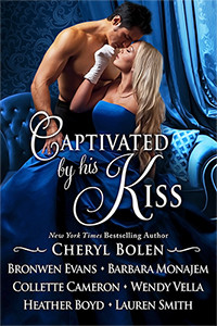
Autographed by me print copy of #1 Regency bestseller Captivated by His Kiss (US Only)
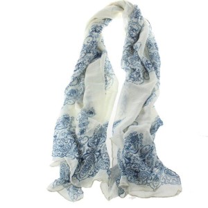
Silk Scarf (US Only)
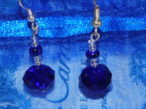
Blue and silver beaded earrings (Styles vary-US Only)
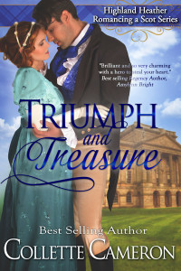
Digital copy of Triumph and Treasure
Digital copy of A Kiss for Miss Kingsley
$10.00 Amazon Gift Card

![Welcome to My New Website and Blog 5 Pageflex Persona [document: PRS0000026_00099]](https://collettecameron.com/wp-content/uploads/2015/01/A-Kiss-for-Miss-Kingsley_Thumb300-189x300.jpg)


Love the look of your new sight. 🙂
Thank you Catherine and Don.
Collette, well done! I hope the transition goes smoothly and you get as much support on this site as you did the other. Blue is my favorite color and romance soothes my soul. Congratulations on the launch of your new web page. Confetti! Champagne! Chocolate!
Oh, chocolates! Always.
Love your new site! I just signed up for your newsletter, and look forward to reading updates.
Wonderful, Trish.
Thank You Collette for this beautiful giveaway!
My pleasure, Nicole.
Congratulations on your lovely new website
Thanks for popping in, Sarah. I’ve got a short list of things to still get done but was anxious to get the new site live.
This is great, congrats!
Thank you so much, Crystal.
Looks beautiful, congrats! I love blue, it’s my favorite.
Hi Monica. Thank you. Mine too.
Beautiful and BLUE (my favorite color). This is lovely website.
My favorite too, but I bet you guessed that.
So blue. So you. Love the new site. ♥
Snicker. Yeah, had to have the blue, Steve.
Love the new look! Already receive your newsletter!
Wonderful!!
Congratulations on your new site. Looks lovely.
So glad you stopped by, Taren. A little more polishing to go, but I’m almost there.
Congratulations on your beautiful new site.
Thank you, Patti!
I love the new website! I do, however, miss your china tea cups.
I do too, a little.
Love this new site! Congrats!
Thank you, Jessica. Vicki created the logo.
It’s lovely, Collette – and so YOU! Congrats on the new look.
Had to have the blue and the roses, Lauren.
Changes always bring new great things, Collette! Signed up for the newsletter 😉
I hated to leave my old site because I loved it so much, but as you said, change can bring great things.
Lovely site! I like the sleek, new look.
Me too!
It’s beautiful…true to your Blue! And easy to navigate which is always a joy. Best wishes as it soars right on up there.
I hope so, Jeanine!
I love the new site. Congratulations!
Thank you, Veronica!
Will miss the old site but congrats and all the best with this new journey into cyber world.
I know, Netasha. It was hard to leave the other, especially since I had over 250,000 page views last year.
Lovely site. I am glad you kept the blue rose.
Have to have blue roses! They are part of my branding.
Good luck, I’m sure you will reach 300,000 in no time!
Ha, we’ll see.
Lovely, Collette! Very classy.
Thank you Kim!
Bluetiful!
Ha, Tracey, I love that!
Very nice!
Thank you Raine!
Love the new look, blue is my favorite color. I am already a newsletter subscriber!
That’s great, Sheryl!
Very pretty, clean, crisp! I like that style!
It’s a big change for me, but I really like it.
I couldn’t find a place to like. It looks great. Love the color. Thank you. Subscribed to newsletter.
Melody, we’re still setting a few things up including the subscribe and like features. Thanks so much for stopping by!
I like it,!!!!!
Very pretty graphics!
Thanks, Beverly!
Love the new website!
Hi Ann! I kept the blue.
The new website looks great!
Thanks, Kara!!
Love the new site! I’ve subscribed using my new email address dedicated to books, author newsletters & my Etsy store.
I didn’t know you had an Etsy store! What do you sell?
Very nice! Thanks Collette!!!!
My pleasure!!
The new site looks terrific!
Thanks!! Still have a few bugaboos to work out, but we’re getting there.
Love your new site, Collette… and, of course, it’s blue – my favorite color. 🙂
Liette, I couldn’t give up my blue!
Congratulations on the new site, I think it looks great! I know you’ll hit 300,000 again 🙂
Thanks so much, Joy!
looks nice
signed up for newsletter
Love your site. The blue is a great choice, eye catching. I’m sure you’ll surpass the 300,000 views you had on your last. Keep up the amazing work.
It’s a slow process starting over, but I hope to catch up quickly.
Congrats on your new website. It’s goes perfect with your book covers.
That’s the idea, Yaritza. I’m so glad it works!
I like the new website. Anxious to see how your newsletter will look.
Me too, Jan.
Thanks Joye.
I’m glad it’s easy to navigate. I hate getting to a site and not being able to find what I need.
New site looks wonderfl!
Denise
Thanks Denise!
Love the new website and can’t wait to read the new books
So glad you stopped by!
It looks so clean and uncluttered! I like the new website.
I miss the moving teacups though.
The new format is very pretty and easy to read. I really like the title picture and tue color scheme. Thanks for the contest!
You’re welcome, Heather.
Congrats on the new website and blog, Collette! 🙂
Thanks Marcy. Did you see that you won the rose compact from last month’s newsletter giveaway?
Looks great! nice clean format.
I think so too!
Very clean looking — love the blue (my favorite color)
Mine too, Sandy!
Congratulations on the new website and blog.
Marilyn
Thank you, Marilyn. I’m still trying to figure the ins and outs.
Good luck with the new website and blog. Thanks for the giveaway.
Marion
My pleasure, Marion.
What a great website and blog. Very attractive.
Joan
I’m glad you like it, Joan!
I love your new site. It’s very easy to navigate.
Great looking site! Wonderful giveaway.
It’s a totally different look for me!
Congrats on the new site!
Thanks, Rhiannon.
Beautiful… Your new website is amazing. Congratulations 🙂
Thanks so much, Liz1
One of the things I like about this new site (aside from the lovely shade of blue!) is the fact that you have used a really contrasting color for the lettering. It is very upsetting to try to read a site where they don’t seem to have paid any attention to the fact that some colors/shades just don’t translate into easily seen/read text!
I know exactly what you mean. That was an issue with the site on mobil devices so we changed the font color to make it more readable.
Wonderful.
I like the new site. It’s more streamlined and I like the layout more than your old site. 🙂
I think it’s easier to navigate, Rhianona, and will work when I cross into other genre, which I plan to do someday.
I know this is different for you, but it is a beautiful site.
If I ever figure WordPress out completely, I’ll be in great shape.
Congrats on your new website! 🙂
Thanks Aleen.
CCongrats on the new Web site.
I’m so glad you stopped by, Brenda!