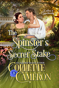
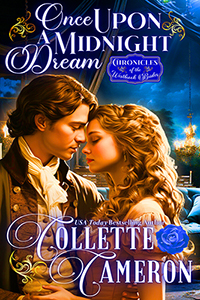
“What’s the first thing we look at when we’re trying to find a book to read?” That’s the question I asked a classroom of fourth graders recently. This is what they said in order:
The front cover.
The excerpt inside the front cover.
Wow! Sound familiar?
I was astounded, not only because not one of them said pictures, but because they look for the exact same things, in roughly the same order as adults do. This pattern begins early in our reading development and lasts a lifetime.
If we like a book by a certain author, we’ll continue to read their books, even if the front cover doesn’t do a whole lot for us. We know what to expect on the inside—well most of the time we do. We’ve all had those surprises—I won’t go there. On second thought . . . I will. It really irks me when I’m intrigued enough by a cover to buy the book, then discover the cover doesn’t accurately depict the contents. It feels like the old bait-and-switch. Grrrr.
Oh, yeah … think about when you’re browsing the shelves for a book. It’s that front cover that piques your interest. You know it is. You pick it up, turn it over, and read the blurb on the back. The reverse is true too. I know if I don’t like a cover, for whatever reason, I’m not going to read the back blurb. No blurb, no buying.
You need to make sure your cover targets your intended audience too. I don’t like historical covers that have computer generated characters, because to me, they’re not authentic. I can appreciate computer generated images more for science fiction or fantasy covers.
You might not be able to judge a book by its cover, but it darn well better be a snappy one anyway!
Now, if you’d like, I invite you to post your book cover or a link to your cover.


